March 2008
JAY-O.COM | Jan Olof Nygren
THIS SITE CONTAINS SAMPLES OF THE WORK OF THE FABULOUS MR. JAN OLOF NYGREN.
IT IS A MIX OF SELF INITIATED PROJECTS DONE AT CRANBROOK AND CLIENT WORK.
August 2007
July 2007
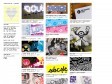
shillPages - Movie Title Screens Page
by 7 othersWhat good is it? Whatever use you put it to. Browse and admire title and logo designs, check out movies that have completely different titles in different release prints (see Battle of Britain or The Premature Burial for good examples), check out the differences in multiple releases of the same title (see Aliens or Invasion of the Body Snatchers for a good example), check to see just how "wide" is the widescreen (width/height=aspect ratio... and does it match the sleeve description?)... use the logo when designing a web page for your favourite movie...include the title screens in your video database... the possibilities are... well, not endless, but many! Please note that the aspect ratio shown is merely calculated from the image size and, although very close to the actual ratio, may not be 100% accurate.
November 2006
March 2006
The Logos of Web 2.0 | The FontShop FontFeed | Font blog, typography tips, and design news.
by 45 othersBut even more characteristic among these brands is their appearance. Web 2.0 sites nearly always feel open and friendly and often use small chunks of large type. The colors are bright and cheery — lots of blue, orange, and what we jokingly call the official color of Web 2.0: lime green.
September 2005

March 2005

Letterhead Fonts
by 12 othersRare and Unique Typefaces for Artists / copying old style letters & signs.
1
(7 marks)